Shared contract
<html data-theme="dark">Kajabi Admin Dark Mode
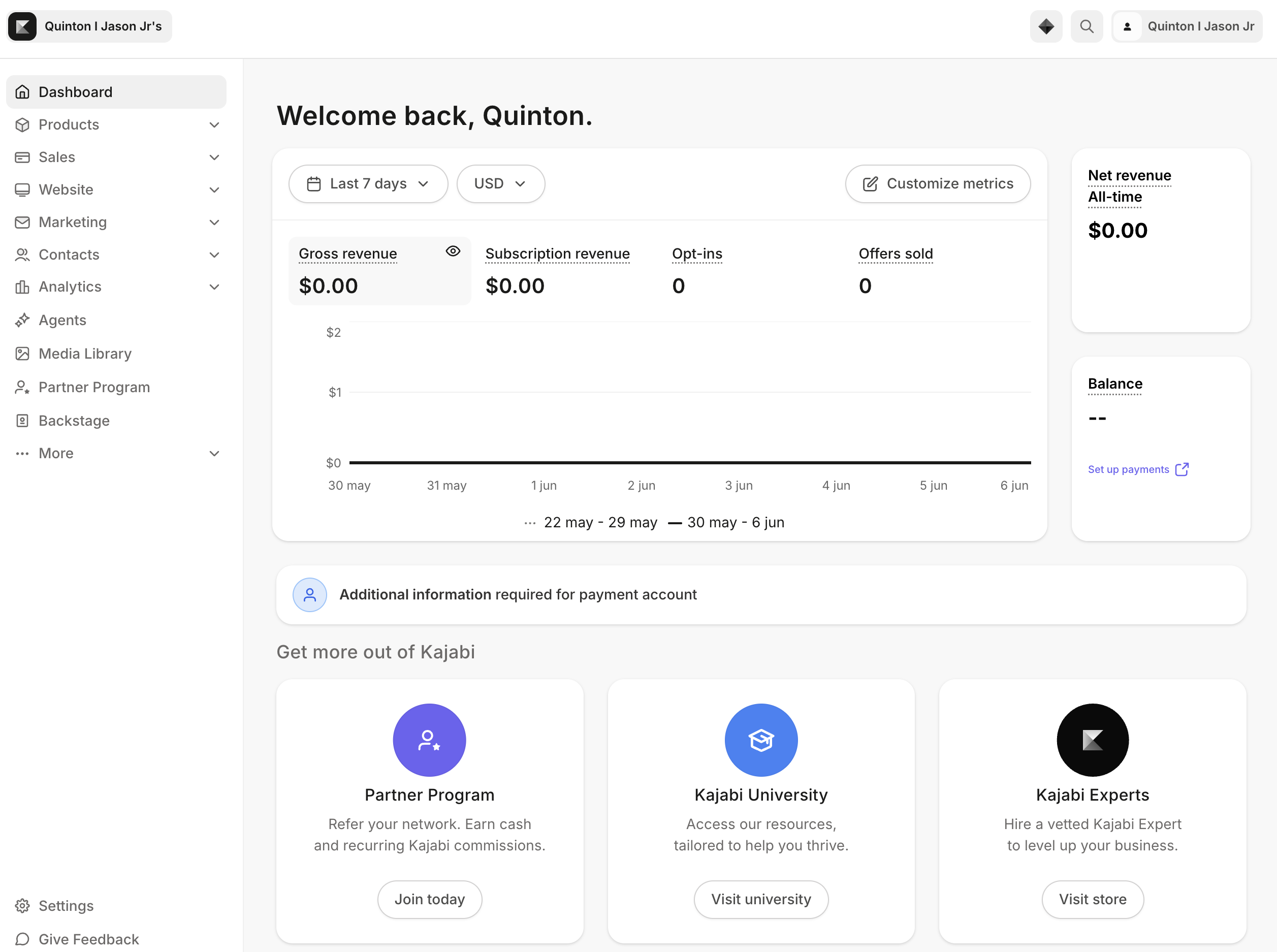
In 2026, Kajabi released dark mode for its admin experience. The feature looked simple from the outside, but the work behind it exposed hidden design system debt across Rails, React, Sage, TinyMCE, Pine, and multiple generations of product UI.
Overview
The Design Systems team treated dark mode as infrastructure. My role focused on the architectural patterns, semantic token adoption, migration strategy, and implementation details that let dark mode scale across a decade-old admin platform.
The challenge was not creating dark colors. The challenge was helping every surface understand what those colors meant.
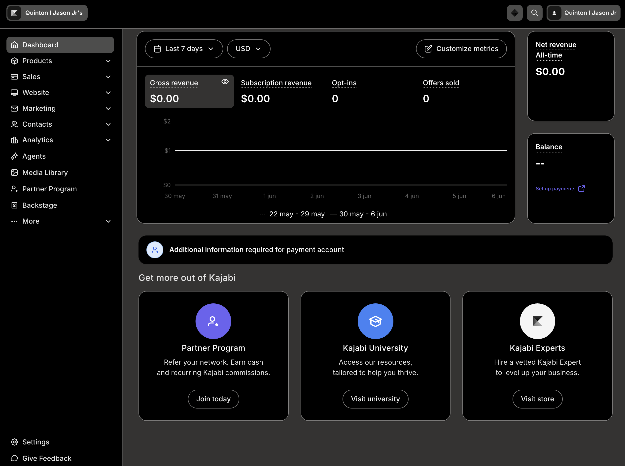
Before / After Impact
A second theme made disconnected color decisions visible. Hardcoded values, legacy components, embedded editors, and third-party assumptions all became part of the same systems problem.
Theme Architecture
The key architectural decision was using one source of truth for theme state instead of letting each app, surface, or component family manage theme independently.
<html data-theme="dark">Independent theme management would have created competing sources of truth, inconsistent persistence, and duplicated implementation logic. The root contract gave every surface the same signal.
<html data-theme="dark">Server-rendered surfaces read the same contract.
Product experiences resolve theme state consistently.
Design system UI renders with semantic tokens.
Legacy surfaces participate during migration.
Embedded editors receive mirrored theme state.
Semantic Token Strategy
Semantic tokens moved theme behavior out of individual CSS decisions and into a shared design system language.
The important shift was not visual. It was moving from direct color declarations to tokens that describe product intent. Once surfaces used semantic tokens, light and dark themes could resolve through the same implementation path.
Hardcoded values made theme behavior a local styling problem.
background: #ffffff;
color: #222222;Semantic tokens made theme behavior a system contract.
background: var(--pine-color-background-container);
color: var(--pine-color-text);
Legacy Compatibility & Migration
Large parts of Kajabi Admin still depended on Sage, older color systems, Rails views, and inherited styling. Waiting for a full rewrite would have made dark mode impractical.
Rails, Sage, older color systems, and inherited product styles.
Mapping and migration patterns connected old surfaces to theme intent.
Semantic tokens and shared theme state enabled consistent behavior.
This was the adoption work underneath the feature: helping teams move away from hardcoded color values and into a modern theme architecture without stopping product delivery.
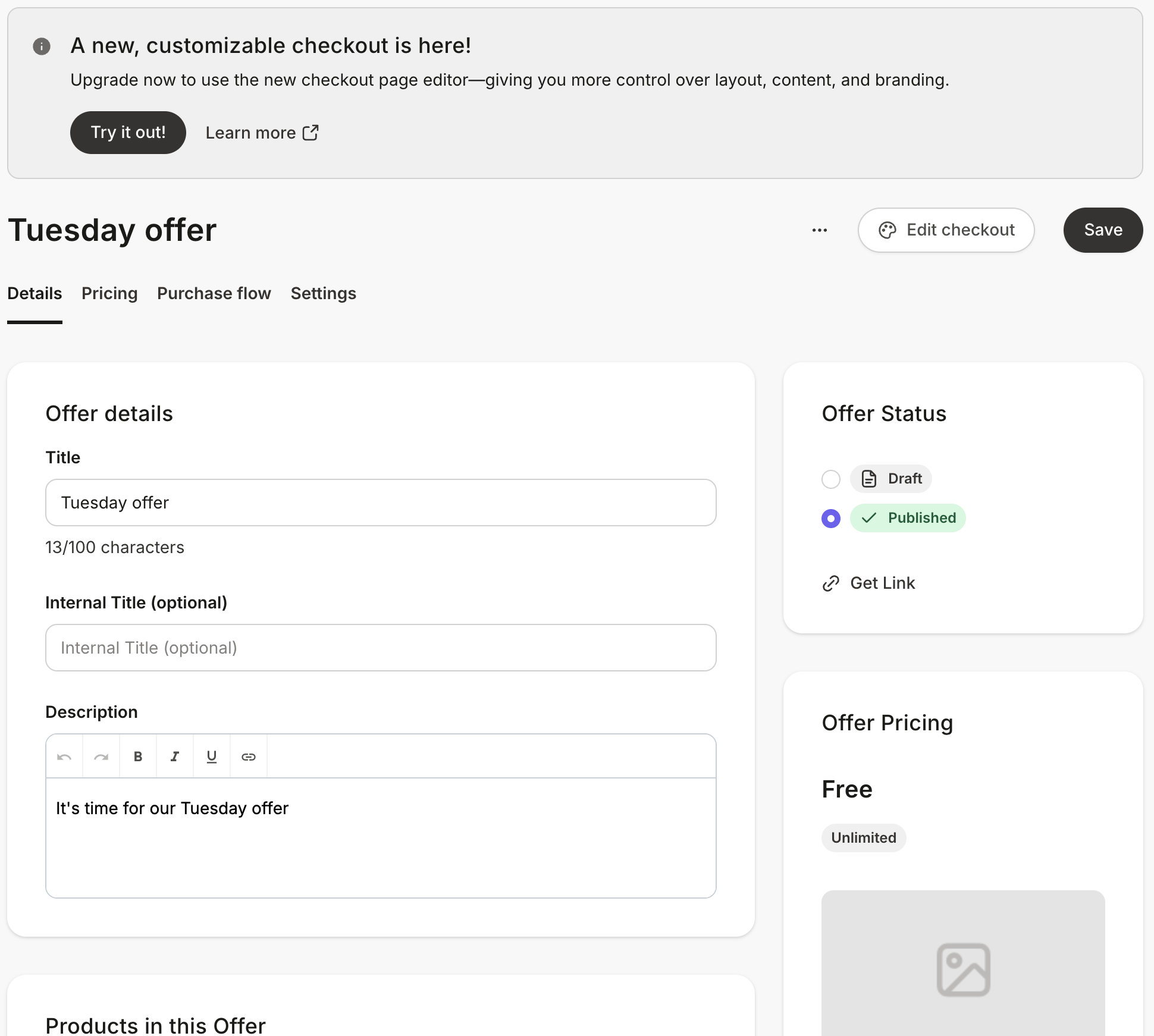
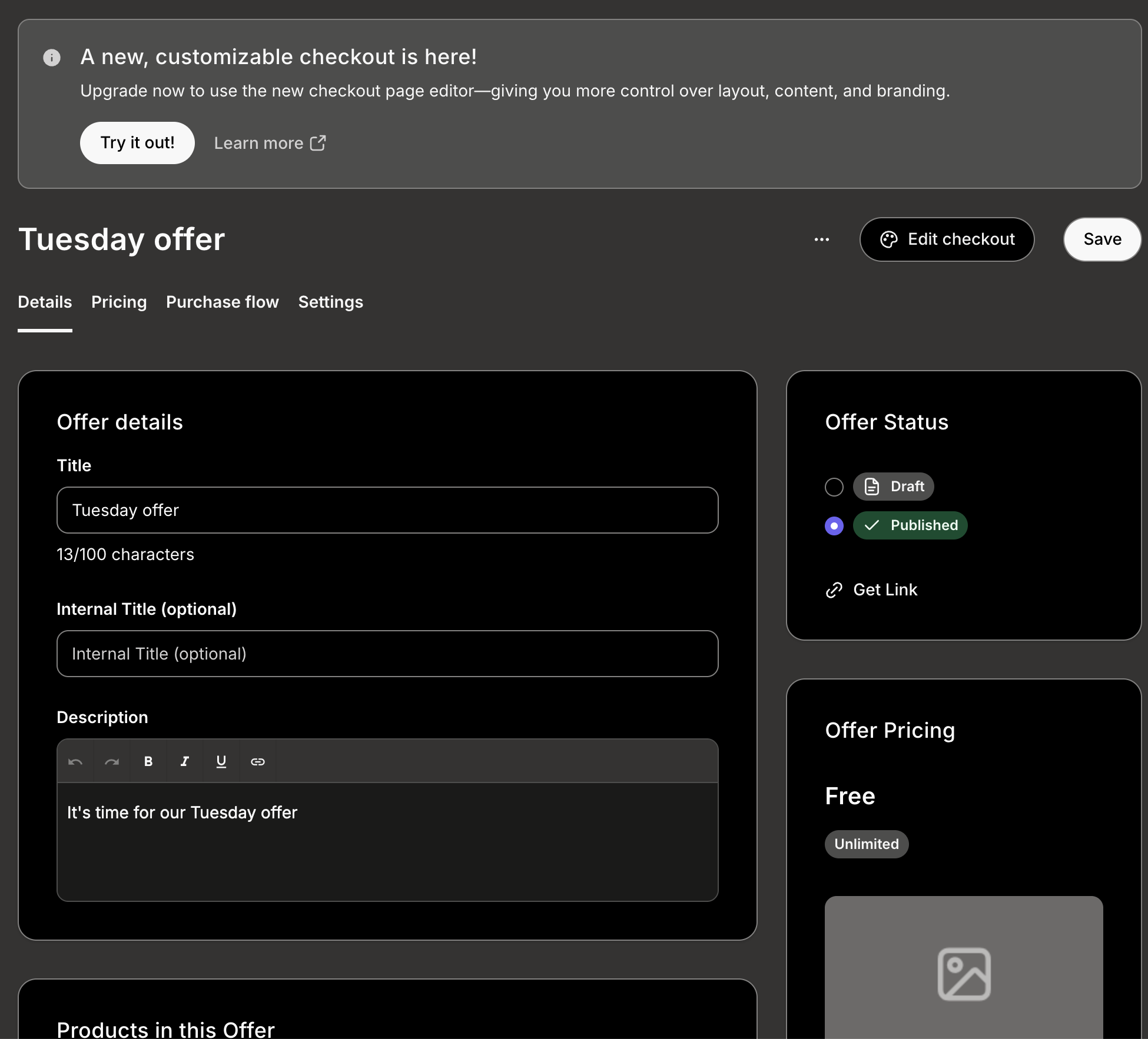
TinyMCE & Embedded Systems
The editor rendered inside an iframe. That meant it operated as a separate document and could not automatically inherit CSS variables or theme state from the parent app.
Rollout Strategy
The rollout had to protect creator preferences, support internal testing, and work with account masquerading without accidentally changing someone else's theme state.
Control availability for internal testing and gradual release.
Persist the creator's light or dark mode choice across sessions.
Respect workflows like masquerading without overwriting creator state.
Apply the root theme contract across app, design system, and embedded surfaces.
Outcomes
The work created a scalable theming architecture, improved the migration path for legacy UI, reduced reliance on hardcoded color values, and gave future teams a foundation for theme-aware product development.
Reflection
The biggest lesson from this project is that dark mode is not really a dark mode project. It is a design systems project. Features like dark mode expose every inconsistency hiding within a platform.
Dark mode did not create the technical debt. It revealed it.
Most people will not think about semantic tokens, theme contracts, compatibility layers, or iframe styling strategies. They will notice that dark mode works. That is the point. The best design system work often disappears into the product.